Wednesday, May 6, 2009

front cover

This is my finished front cover. I am pleased with how genuine it looks and I think the picture and colour scheme work very well together and also the mixture of fonts.

Contents page

This is my finished contents page. I like the simple layout and I think its easy to read and I like the pictures I put on as i think it makes it more interesting to look at.

Tuesday, May 5, 2009

Double Page Spread


This is my final product of my double page feature article. I am pleased with the pictures and layout and i also think my article sounds professional.

Front Cover Development

I printed off my front cover to see how it looked. I wasn't happy with how it looked, it looked unprofessional and didnt have enough on it and some things looked too big for the page. I decided to do some writing and sketches on the print out so i could improve it.

Double page spread images


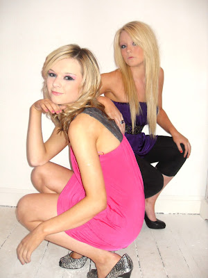
These are all the pictures i have chosen to use on my feature article. I chose them because they are different from the ones i used on the front cover and contents page and also because i think the colours work well. I think all the poses the girls are in are typical of a feature article photoshoot and they look professional.
I think the pictures work well together as they are all different but compliment each other and so they are interesting to look at.


Front cover pictures


I choose this picture for my front cover as i think it is a good picture. Both girls are looking into the camera to grab the audience's attention and i think the pose of the girls is interesting to look at. I also like the colours, they stand out against the white which makes it look professional and the pink is a typical pop colour especially suitable for my target audience of young teenage girls.

Contents Pictures


I took these pictures to put on my contents page. They reflect storylines I am planning to put on my contents page.


drawing plans

Layout Plans

This plan is basic, but i like the idea of the pictures being scattered through the text- a technique I think ill use in my final design.
I liked the layout of this contents to I developed it further.


This plan is more detailed as i like the layout so i added more to it.


I began to draw a few plans of my front cover, contents page and my double page spread to help me when creating it and to see which layout would work best. I drew a few basic sketches and then went into more detail which helped a lot when i came to creating my pages on photoshop and indesign.